With many users of the internet actively using mobile devices these days, it has never been more important to make your website mobile-friendly. The business benefits from mobile site improvements can quickly more than offset the website developer cost.
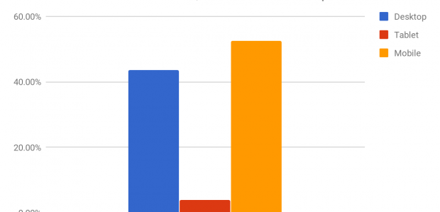
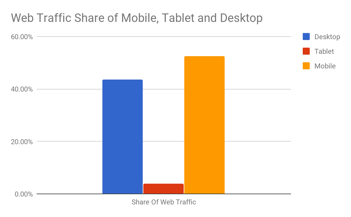
Mobile devices that have internet-connection capabilities have taken over a larger share of internet traffic in the last decade. This is thanks largely to the success of the iPhone, with its iOS mobile operating system. The further success in the market of Google’s Android operating system has helped the trend. According to data from StatCounter, mobile share of web traffic is 52.52% as of June 2018 while on the desktop it’s 43.63%.
Chart: Web Traffic Share of Mobile, Tablet, and Desktop
Going forward, a failure to make your website mobile-friendly can result in a poor user experience for your customers. With this in mind, below, we present the most compelling reasons in favor of making your website mobile-friendly.
1. Sites Not Optimized for Mobile Have Higher Bounce Rates
The first reason to make your website mobile-friendly is to reduce your site’s bounce rate. The “bounce rate” is the percentage of your traffic that visits your site’s landing page then clicks away to another website without visiting other pages on your website.
When mobile device users encounter a page that is not mobile-friendly, the poor appearance of the page fails to engage them. As a result, they will not stay to explore your products or other important pages on your website. They will visit other websites instead.
2. Unoptimized Sites Suffer a Drop in SEO Rankings
The second reason to be concerned about mobile-friendliness is for SEO rankings. Websites that are not mobile-friendly suffer a drop in SEO rankings. Google and other search engines have already begun to factor in mobile-friendliness into how high a website can rank in search results.
Well-known SEO Expert Brian Dean of Backlinko says that “Google’s Mobile-first Index ranks the search results based only on the mobile version of the page. And yes, this occurs even if you’re searching from a desktop.”
This means that, with an unoptimized website, your content might be great and relevant, but the search engines will not rank you high. As a result, traffic to your website will be poor or even decrease over time.
3. Making Your Site Mobile Friendly Will Improve E-commerce Conversions
For e-commerce websites, in particular, the mobile-friendly design will improve e-commerce sales conversions. You might be unsure what we mean by the term “e-commerce conversions” but it’s really quite simple.
When you drive visitors to your e-commerce website you ultimately want is not visits as such. Your goal might be to sell a fashion item or a service such as dental services. When one of the visitors you drive to your website sees your offer on the page and signs up or orders the package, that is an e-commerce conversion.
With a website not optimized for mobile devices, a good fraction of your visitors will be distracted by the clunkiness of the page. As such, they will not ultimately go on to order your products or services, reducing your conversion rate in the process.
4. Having A Mobile-friendly Site Improves The User Experience (UX)
The final major reason to optimize your website’s mobile-friendliness is in order to create a good UX that reflects positively on your brand.
The term “UX” stands for “user experience.” This refers to the quality of the user’s interaction with your website. A website that is not mobile-friendly creates more problems for the user than a better-optimized site. In reality, UX goes beyond just the user’s experience of your website to impacting the user’s experience of your entire brand.
Think about it. If a user has to book a hotel stay, but one hotel’s website does not load properly on mobile, and the user interface is bad, the user might naturally assume the hotel is no good either. A good UX on your website can help portray your company as friendly and professional.
How To Create A Website That Is Mobile-friendly
If you are ready to begin improving the mobile-friendliness of your website, here are some steps you can take. First, you might want to conduct a mobile-friendliness audit to benchmark your website against the best standards. You can do this with your own designers or hire a web development agency to do it for you. Secondly, you can have your designers create a mobile-first responsive design that will work great for all kinds of mobile devices.
Steps to a More Effective Business Website
In essence, you should be looking to make your website mobile-friendly in order to avoid problems such as high bounce rate and low SEO rankings. Beyond that, making your site mobile-friendly can improve not just the UX of visitors to your site, but your e-commerce conversions as well. These are all worthwhile benefits that every company should have in mind for improving its website’s effectiveness.